The Request
Increase traffic to App Stores from website. While GasBuddy had over 1MM positive reviews in the iOS and Android app stores, they wanted to leverage their web property for better growth.
Key Takeaways
Test often and research relentlessly, seeking to unstick the most clogged part of your funnel.
Overview
GasBuddy.com, the leading service provider for crowd sourced gas prices and operator of a top mobile app, approached us to help understand and improve underperforming content. While we ran an extensive suite of tests addressing multiple KPIs, this case study focuses on a test to drive more traffic to the App stores for application downloads.

What We Accomplished
- 1227% increase in the conversion rate of clicks to the app store on a core page type.
Below you can see the results of rolling the test variant out in production.
Immediately, there was a marked, significant, and immediate uplift in Get App conversions from mobile device landings on station pages, as shown in the table below.
| Nov 1-3 | Oct 25-27 | Uplift | |
| Get App conversion rate | 0.80% | 0.06% | 1227% |
How We Did It
In order to achieve consistent growth on the web, we need a growth oriented mindset and much, much faster speed of implementation. Synergizing with conversion increases offers a vital, irreplaceable way to hedge against risks and challenges in the search space.
On review of the “Get App” CTAs, several improvements were clear:
- Place key content above the fold
- Hierarchy applies in communicating to users what you think is most valuable / worth their attention. While users expect to scroll, this doesn’t eliminate the advantage to first-visible content.
- Add social proof
- Always look for ways to leverage the positive opinions of populations that mirror your target audience in order to build trust.
- Add benefit statements
- When asking a user to take an action, especially a new action make the value of taking the desired action clear and tangible.
Applying the above meant making several clear changes to the control content:
- We tested high and low positioning of the CTA block
- We altered the context copy to include concise, clear benefits statements
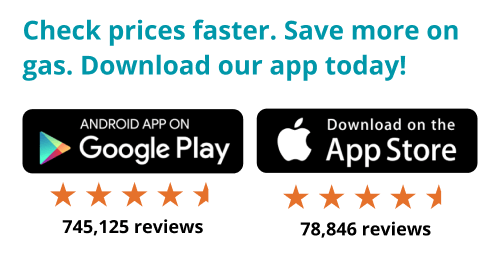
- “Check prices faster. Save more on gas”
- Interestingly, subsequent tests removing this copy, showed it was not a primary driver of conversions. The other changes we made carried much more weight in driving action.
- We increased the size of the download buttons
- We leveraged rating stars and volume of reviews to signal social proof.

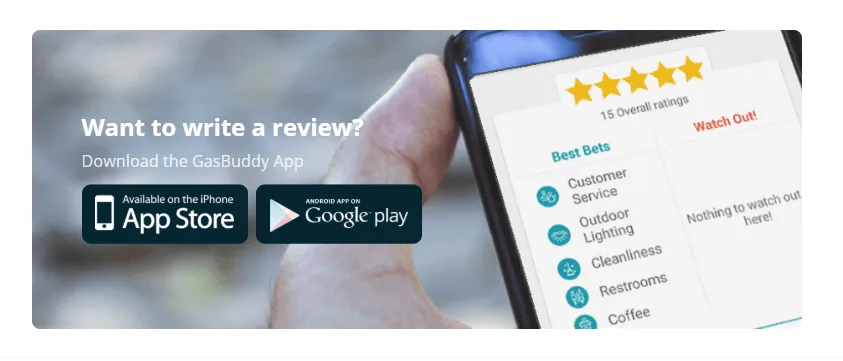
Control (CTA below the fold)

Want help measuring and auditing your funnel to see where you are stuck and how you can instantiate continuous improvement and growth? Let’s chat!
